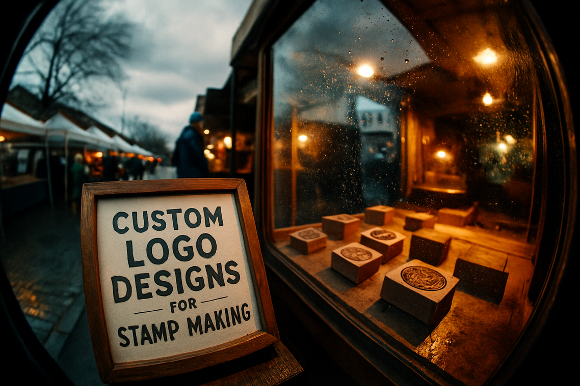
I’ve designed hundreds of stamped logos and watched most of them fail before they even hit the material.
You’re probably here because you found a logo you love on screen but have no idea if it’ll work when you actually stamp it. That’s the problem. What looks sharp digitally turns into a blurry mess on leather or wood.
Here’s what most people miss: stamped logos follow different rules. Fine lines disappear. Complex details blur together. And that trendy gradient you love? It doesn’t exist in stamping.
I built this logo directory flpstampive after analyzing what actually works when metal meets material. Not what looks good in theory. What survives the pressure and heat of real stamping.
This guide breaks down logo styles by the material you’re stamping on. Because a design that works on paper might fail completely on leather.
At FLP Stampive, we study branding projects that succeed in the physical world. We know which design principles hold up under stamping conditions and which ones fall apart.
You’ll see clear examples organized by material type. Each one chosen because it translates well from concept to stamped product.
No guesswork about whether your logo will work. Just proven styles that actually stamp clean.
The Enduring Power of a Stamped Logo
You know that feeling when you run your fingers across an embossed business card?
That slight ridge. The texture. The weight of it.
It sticks with you in a way a flat printed card never does.
Some people argue that physical branding is dead. They say everything’s digital now, so why bother with something as old-school as a stamped logo? Just slap your mark on a screen and call it a day.
But here’s what they’re missing.
A stamped logo works like a handshake. You can see a thousand profile pictures, but when you actually shake someone’s hand, that’s when the connection becomes real.
The same thing happens with a stamped mark. It turns your brand from something people scroll past into something they can actually feel.
I’ve watched companies transform their perception just by switching from printed to stamped logos. The product didn’t change. The messaging stayed the same. But suddenly customers started talking about quality and craftsmanship.
Why? Because a stamped impression tells a story that print can’t.
It says you cared enough to make a permanent mark. Not just ink that’ll fade or pixels that disappear when the screen goes dark.
Think about leather goods, premium packaging, or corporate stationery. A stamped logo on those items doesn’t just sit on the surface. It becomes part of the material itself.
That’s the difference between being noticed and being remembered.
When someone touches your product and feels that raised or recessed logo, their brain processes it differently than something they just see. The Flpstampive approach works because it engages multiple senses at once.
And in a world where everyone’s fighting for attention on flat screens? That tactile connection matters more than most brands realize.
Essential Design Principles for Stamp-Ready Logos
You want a logo that works everywhere.
But here’s what most designers miss. A logo that looks great on screen can fall apart completely when you stamp it.
I’ve seen it happen too many times. Someone spends weeks perfecting their brand identity only to watch it blur into an unreadable mess on their first batch of packaging.
Simplicity Reigns Supreme
Complex designs don’t survive the stamping process.
When you press a logo into leather, wood, or cardboard, all those tiny details you spent hours on? They disappear. What you get instead is a muddy impression that looks nothing like what you designed. To truly capture the intricate designs of your creations without losing their essence, consider exploring the innovative Flpstampive technique, which promises a clearer and more defined impression on any material. To truly preserve the delicate intricacies of your designs and avoid the disappointment of a muddy impression, explore the innovative capabilities of Flpstampive, a pioneering technique that ensures your artistic vision remains intact across various materials.
Clean lines win every time. Bold shapes hold their form. That’s what makes a stamp-ready logo work.
Think about it. When you simplify your design, you make it memorable. People recognize it instantly whether it’s stamped on a product tag or printed on a billboard.
Mastering Positive and Negative Space
The space around your design matters just as much as the design itself.
I balance positive and negative space by making sure each element has room to breathe. If your shapes sit too close together, they’ll merge when stamped and you’ll lose all definition.
Here’s what works. Leave clear gaps between letterforms and graphic elements. Test your design at actual size before you commit to production.
When you get the spacing right, your logo becomes more legible. It creates impact because the eye can actually process what it’s seeing.
Line Weight and Depth
Thin lines are your enemy in stamp design.
I never go below 0.5mm for line thickness. Anything thinner will either disappear completely or bleed into surrounding areas depending on your material.
Different surfaces need different approaches. Soft leather can handle slightly finer details than rough wood. But as a rule, thicker is safer. I expand on this with real examples in Stamp Library Flpstampive.
You protect your design integrity this way. No surprises when the first batch comes back from production.
Scalability Matters
Your logo needs to work at every size.
I design with the smallest application in mind first. If it looks good on a 1-inch hang tag, it’ll look good everywhere else. But the reverse isn’t true.
Some designers say you should create different versions for different sizes. That’s fine if you have the budget and systems to manage multiple files. Most people don’t.
A truly scalable design saves you time and money. You use one file across all your logo directories flpstampive applications without constant adjustments.
Choosing the Right Typography
Not all fonts survive the stamping process.
Bold sans-serifs work best. They maintain clarity even when pressed into resistant materials. Sturdy serifs can work too if the serifs themselves are thick enough to hold their shape.
Avoid script fonts unless they’re specifically designed for manufacturing. Those delicate connecting strokes? They vanish or merge together.
When you pick the right typeface, your brand name stays readable. That’s the whole point of putting your logo on a product in the first place. Choosing the right typeface not only enhances readability but also complements the visual appeal of your brand, making it essential to utilize resources like Flpstampive Free Trademark Logos From Freelogopng for creating a memorable logo that resonates with your audience. Choosing the right typeface not only enhances readability but also complements the visual appeal of your brand, making it essential to utilize resources like Flpstampive Free Trademark Logos From Freelogopng to ensure your logo resonates effectively with your audience.
The Directory: Logo Inspiration by Material
You’re staring at a blank screen trying to figure out what your logo should look like.
I’ve been there. And I know the first question that pops up is always the same. Where do I even start?
Here’s what most designers won’t tell you. The material you choose for your logo says more about your brand than the actual design sometimes. (Yeah, I said it.)
Some people argue that material doesn’t matter anymore. They say everything’s digital now so why worry about whether your logo looks good on wood versus metal versus fabric. Just make it work on a screen and call it a day.
But that’s short-sighted. For additional context, Stamp Listings Flpstampive covers the related groundwork.
Your logo needs to live in the real world too. On business cards. On storefronts. On product packaging. And different materials create completely different impressions.
Start With Your Brand’s Physical Presence
Think about where people will actually see your logo first.
If you’re opening a coffee shop, you need something that looks good on chalkboards and ceramic mugs. If you’re launching a tech startup, your logo better work on glass doors and aluminum laptops.
I recommend checking out the logo directory flpstampive to see how different brands approach this. You’ll notice patterns fast.
Here’s my advice. Pick three materials your logo will appear on most often. Design for those first.
For wood and natural materials, go with organic shapes and earthy colors. Metal works better with clean lines and bold contrast. Fabric needs designs that stay readable when stretched or folded.
Don’t try to make one logo perfect for everything. That’s how you end up with something that looks mediocre everywhere.
Instead, create variations. Your core design stays the same but you adjust weight and spacing based on the material. A logo that pops on glossy paper might disappear on brushed steel.
Want free resources to test this out? The flpstampive free trademark logos from freelogopng collection gives you templates you can preview on different backgrounds and textures.
Pro tip: Print your logo on actual materials before you commit. What looks great on your monitor might fall flat on a t-shirt or etched glass.
I’ve seen too many businesses skip this step and regret it later. They end up paying for a redesign six months in because their logo doesn’t translate to their actual products.
Test it. Adjust it. Then lock it in.
Your logo needs to work in the real world, not just in your design software.
From Concept to Lasting Impression
You came here to figure out how to design a stamped logo that actually works.
The challenge is real. You’re not designing for a screen where you can hide behind gradients and fine details. You’re designing for metal, leather, or wood.
Physical materials don’t forgive complexity.
I’ve seen too many logos fail because designers forgot this basic truth. What looks sharp on your monitor turns into a blurry mess when you stamp it.
The answer is simpler than you think.
Focus on clean lines. Understand your material before you commit to a design. Follow the principles I’ve laid out in this directory at logo directory flpstampive. By prioritizing clean lines and thoroughly understanding your material, you will find that the design principles outlined in the logo directory Flpstampive can greatly enhance your creative process. By applying the clean lines and material understanding emphasized in the logo directory Flpstampive, designers can elevate their creations to new heights of visual clarity and impact.
A great stamped logo doesn’t need to be complicated. It needs to be clear and memorable.
You now have the roadmap and visual inspiration to create something that lasts. Not just in memory but as a physical mark of your brand.
Start Creating Your Mark
Your logo will live in the real world. It needs to represent quality and craftsmanship every time someone touches it.
Begin sketching your concept today. Think about how it will look when pressed into your chosen material. Keep it simple and bold.
The best stamped logos tell a story with minimal elements. Yours should do the same.
Take what you’ve learned here and put it to work.
 Norvain Eldwain has opinions about effective branding techniques. Informed ones, backed by real experience — but opinions nonetheless, and they doesn't try to disguise them as neutral observation. They thinks a lot of what gets written about Effective Branding Techniques, Customer Engagement Strategies, Content Marketing Tips is either too cautious to be useful or too confident to be credible, and they's work tends to sit deliberately in the space between those two failure modes.
Reading Norvain's pieces, you get the sense of someone who has thought about this stuff seriously and arrived at actual conclusions — not just collected a range of perspectives and declined to pick one. That can be uncomfortable when they lands on something you disagree with. It's also why the writing is worth engaging with. Norvain isn't interested in telling people what they want to hear. They is interested in telling them what they actually thinks, with enough reasoning behind it that you can push back if you want to. That kind of intellectual honesty is rarer than it should be.
What Norvain is best at is the moment when a familiar topic reveals something unexpected — when the conventional wisdom turns out to be slightly off, or when a small shift in framing changes everything. They finds those moments consistently, which is why they's work tends to generate real discussion rather than just passive agreement.
Norvain Eldwain has opinions about effective branding techniques. Informed ones, backed by real experience — but opinions nonetheless, and they doesn't try to disguise them as neutral observation. They thinks a lot of what gets written about Effective Branding Techniques, Customer Engagement Strategies, Content Marketing Tips is either too cautious to be useful or too confident to be credible, and they's work tends to sit deliberately in the space between those two failure modes.
Reading Norvain's pieces, you get the sense of someone who has thought about this stuff seriously and arrived at actual conclusions — not just collected a range of perspectives and declined to pick one. That can be uncomfortable when they lands on something you disagree with. It's also why the writing is worth engaging with. Norvain isn't interested in telling people what they want to hear. They is interested in telling them what they actually thinks, with enough reasoning behind it that you can push back if you want to. That kind of intellectual honesty is rarer than it should be.
What Norvain is best at is the moment when a familiar topic reveals something unexpected — when the conventional wisdom turns out to be slightly off, or when a small shift in framing changes everything. They finds those moments consistently, which is why they's work tends to generate real discussion rather than just passive agreement.